Screen recording text layout tips for clear visual guide
"A cluttered screen is a silent barrier to understanding, often obscuring the very information a viewer seeks to grasp."
Effective screen recording requires strategic text placement and graphic design to ensure that overlays do not obscure the primary content.
By utilizing clear margins, high-contrast elements, and non-obtrusive layouts, creators can maintain high readability without distracting from the visual demonstration.
Key takeaways: * Prioritize the central workspace by keeping text and graphics in the periphery. * Use high-contrast colors to ensure text remains legible against varying backgrounds. * Maintain consistent spacing to prevent visual clutter during transitions.
How can we achieve effective screen recording text layout?

A hand moves a mouse across a brightly lit monitor, hovering over a complex software interface where a cursor glides smoothly. Setting the foundation for a successful screen recording text layout requires understanding the hierarchy between the moving cursor and the static information on the screen.
The primary goal is to ensure that the visual subject remains the focus while supplementary information remains accessible. This means placing text in areas where the software interface or the user's cursor is unlikely to travel.
If the recording captures a specific window, the text should occupy the empty space around that window to avoid overlapping critical controls.
When the screen is crowded, the viewer's eye may struggle to find the intended point of interest. Effective screen recording text layout relies on the principle of negative space, where empty areas of the screen serve as a buffer for text.
This prevents the visual fatigue that occurs when a viewer must hunt for information amidst moving elements.
- Define the focal point of your screen content.
- Allocate empty space around text elements to prevent clutter.
- Align text with the natural movement of the cursor.
What are the best strategies for video text placement tips?
A designer drags a text box toward the corner of a digital canvas, carefully checking the distance from the edge of the screen. Implementing effective video text placement tips involves mapping out the "danger zones" of the screen before the recording begins.
Most software interfaces feature menus, taskbars, or toolbars that occupy specific edges. To avoid interference, place text in the corners or margins that are not part of the active workspace.

For instance, if the recording focuses on a bottom-heavy dashboard, the top third of the screen becomes the ideal zone for instructional text.
Sometimes, the subject of the video moves dynamically, requiring more flexible video text placement tips. In these cases, using semi-transparent overlays or subtle shadow effects can help text stand out against different background colors.
This ensures that as the screen content changes, the text remains visible without requiring constant repositioning.
In this sequence, the second step is the most detailed.
How to master readable graphic design?
An artist adjusts the opacity of a colored shape, watching how it interacts with the underlying white background. Achieving readable graphic design in a screen capture involves balancing visual flair with functional clarity.
Graphics used to highlight specific areas—such as circles or arrows—should be thin enough to show the underlying content but bold enough to be seen. Using a high-contrast color that differs from the software's default palette helps the graphic stand out immediately.
However, the graphic should never block the specific button or menu item being demonstrated.
The weight of the lines and the brightness of the colors are central to readable graphic design. If a graphic is too thick, it obscures the detail; if it is too thin, it disappears during playback on smaller screens.
Testing the graphic against various screen brightness levels ensures it remains effective across different viewer devices.
How can we implement a screen capture text guide?
A student sits at a desk, carefully reviewing a recording of a tutorial to see if the labels are easy to read. Following a structured screen capture text guide can prevent common mistakes like overlapping or illegible fonts.
- Identify the active workspace and define the "safe zones" for text and graphics. 2. Select fonts that are clean, sans-serif, and large enough to be read on mobile devices. 3. Apply a consistent color scheme to all text and graphics to maintain a professional look.
After completing these steps, perform a final check by playing the video at a smaller scale. If the text becomes unreadable or the graphics cover the main action, the layout must be adjusted. This ensures that the screen capture text guide is being applied to the specific needs of the content.
What are the best ways to ensure clear text in screen recordings?
A person leans forward, squinting at a screen to see if a small caption is legible during a fast-moving clip. Ensuring clear text in screen recordings often means managing the relationship between motion and static elements.
When the screen content is moving rapidly, static text can become difficult to track. Using a subtle background box or a drop shadow behind the text provides a "ground" that stabilizes the words against the changing background.
This technique prevents the text from "disappearing" into the colors of the software being recorded.
Furthermore, clear text in screen recordings requires keeping the font size consistent throughout the video. Changing sizes abruptly can be jarring for the viewer.
A steady, predictable text presence allows the audience to focus on the demonstration while treating the text as a reliable secondary source of information.
Improving graphic readability through contrast
A hand adjusts the brightness of a monitor, checking how a bright red arrow looks against a dark mode interface. The process of improving graphic readability begins with understanding the background color of the software.
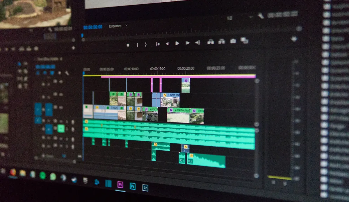
If the software uses a dark theme, bright and light-colored graphics will work best. Conversely, on a light-themed interface, darker or more saturated colors are necessary to maintain visibility.
Using a color that is the direct complement to the background can make an element pop without the need for heavy outlines.
It is also helpful to use motion-sensitive colors when improving graphic readability. If the screen content is very busy, use bolder, more solid colors.
If the screen is relatively static, thinner lines and more subtle colors can be used to provide guidance without overwhelming the viewer's field of vision.
The same subject is also called Tutorial text visibility.
This part also covers Best text placement for videos.
Related






Comments 0