Subtitle length guide: How to master 42-character captioning
This article is about captioning. "Less is more, but only if the reader can finish the sentence before the scene changes."
Determining the ideal length for a single line of subtitles is about balancing readability with visual timing. This guide explores how to maintain viewer engagement through concise text, the technical constraints of screen real estate, and how to avoid the pitfalls of information overload.
* The 40-character rule of thumb for accessibility. * How eye-tracking influences line breaks. * The relationship between reading speed and subtitle duration. * Technical constraints of different aspect ratios. * Avoiding visual clutter in high-impact content.
Why does a single line of subtitles matter?
A viewer rubs their tired eyes in a dark bedroom while the blue light of a smartphone flickers at midnight.
The blue light of a smartphone screen flickers against a dark bedroom wall at 11:30 PM. A viewer swipes through a video, their eyes darting rapidly to catch the meaning of white text dancing across the bottom of the frame.
In the high-speed environment of digital media, the length of a subtitle line acts as the gatekeeper of comprehension. If a line is too long, the viewer spends more time decoding the text than watching the visual story, leading to cognitive fatigue.
If it is too short, the rapid flickering of text causes eye strain and breaks the immersion. Finding the sweet spot ensures that the text supports the image rather than competing with it.
The primary goal of any subtitle is to be "invisible"—to be processed so quickly that the brain integrates the information without the viewer consciously "reading." When a line of text exceeds the natural peripheral vision of a viewer, the eyes must physically move to scan the text, which pulls focus away from the actor's face or the central action.
This physical movement is the enemy of cinematic immersion.

How does the creator economy operate in the age of high-volume content?
A creator sits in a dimly lit studio in Los Angeles, staring at a timeline filled with hundreds of tiny colored blocks representing dialogue. They realize that a single poorly timed subtitle could be the reason a viewer swipes away to a different creator.
The modern digital landscape is defined by content concentration, where a massive volume of media is produced, but the attention of the audience is a finite, dwindling resource. This creates a paradox: while there is more content than ever, the window to capture a viewer's interest is shrinking.
This environment drives the need for hyper-efficient, high-impact content, where every single word must justify its presence on the screen.
In this high-volume economy, the "1% rule" often applies to engagement: a tiny fraction of creators captures the vast majority of attention. To stay within that top tier, creators must master micro-elements like subtitle length.
Concise subtitles allow for faster pacing, which is essential for maintaining the high-energy rhythm that modern algorithms favor.
By keeping the text brief, creators can deliver more information in less time, effectively increasing the "information density" of their videos without overwhelming the viewer.

What is the ideal character count for a single line?
A hand reaches out to adjust a monitor, squinting at a line of text that seems to stretch too far toward the corners of the screen. The text feels heavy, like a weight pulling the viewer's gaze downward.
For most professional captioning standards, a single line of subtitles should ideally stay between 37 and 42 characters. This range is wide enough to allow for meaningful sentences but narrow enough to prevent the text from encroating on the vital visual elements of the frame.
When a line exceeds this limit, it often requires the viewer to shift their focus from the center of the screen to the far edges, which disrupts the natural viewing experience.
To maintain perfect readability, many professionals use a comparison of different text lengths to decide on line breaks.
| Line Length (Characters) | Impact on Viewer | Recommended Use Case |
|---|---|---|
| 1–20 Characters | High legibility, very fast reading | Social media shorts, emphasis |
| 21–40 Characters | Optimal balance of speed and depth | Standard cinematic subtitles |
| 41–60 Characters | Increased eye movement required | Longer dialogue-heavy scenes |
| 60+ Characters | High risk of distraction/fatigue | Generally avoided in professional work |
When working with vertical video formats, such as those found on mobile platforms, the constraints are even tighter. Because the screen is narrower, a line that looks acceptable on a widescreen monitor might feel claustrophobic on a phone.
In these cases, sticking to the lower end of the character count is often the safest way to ensure the text remains legible against complex backgrounds.

How do you manage line breaks and readability?
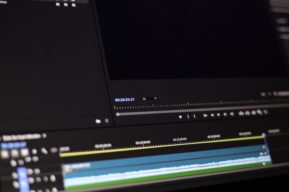
The cursor blinks steadily on a blank editing interface. A creator drags a text block, trying to decide whether to split a sentence into two lines or keep it as one long, thin strip.
Managing line breaks is not just about character counts; it is about the logic of the human brain. We naturally process information in meaningful chunks, such as subject-verb-object structures.
A poorly placed line break—for example, splitting a name from its title or a noun from its adjective—forces the brain to work harder to reconstruct the sentence. This "extra work" is what causes the feeling of a "clunky" subtitle.
To ensure smooth reading, follow these three steps for managing text breaks:
- Group related words together: Always keep adjectives with their nouns and verbs with their subjects. If a sentence must be split into two lines, the break should occur at a natural grammatical pause. 2. Balance the visual weight: If you use two lines of text, try to make the top and bottom lines roughly equal in length. A single long line followed by a single word looks visually "top-heavy" and unbalanced. 3. - Test against background noise: Before finalizing a length, check how the text looks against the most visually busy part of your footage. If the text is too long, it may overlap with important visual cues.
I remember once working on a documentary project where we used wide, cinematic subtitles. Even though the characters were within the limit, the lines were so wide that they cut into the character's eye line.
We had to tighten the character count significantly to bring the text back into a central, non-distracting zone. It taught me that the "safe" limit is often much lower than the "technical" limit.

When should you deviate from standard lengths?
A sudden explosion on screen momentarily clears the frame of all text, leaving only a brief, punchy word in the center. The text is there for a second, then it is gone.
There are specific moments where the standard rules of subtitle length do not apply. In high-action sequences, stylized typography, or artistic montages, the rules of "standard readability" might be secondary to the emotional impact of the scene.
This deviation typically occurs in the following scenarios:
* Emphasis and Impact: When a single word needs to carry the weight of an emotional beat, a very short line (under 15 characters) is more effective than a full sentence. * - Rapid Dialogue: In fast-paced conversations where characters speak in short bursts, the subtitles must match that staccato rhythm. * - Visual Storytelling: If the text is meant to be part of the environment (like a sign or a text message on screen), the length will naturally vary based on the object's size.
However, it is important to note that these deviations are the exception, not the rule. If you deviate from standard lengths in a standard narrative or instructional video, you risk losing the audience's trust.
The goal is to use these "rule-breaking" moments to enhance the story, not to hide a lack of technical skill.
When I tried the steps in order, the second one is where I paused longest.
A common professional standard is to keep a single line of subtitles between 37 and 42 characters. This range ensures that the text remains within the viewer's easy peripheral vision and does not require excessive eye movement.
Related






Comments 0